
What Is a UI Kit? What's Inside One and How to Use It
By Manob Editorial ·
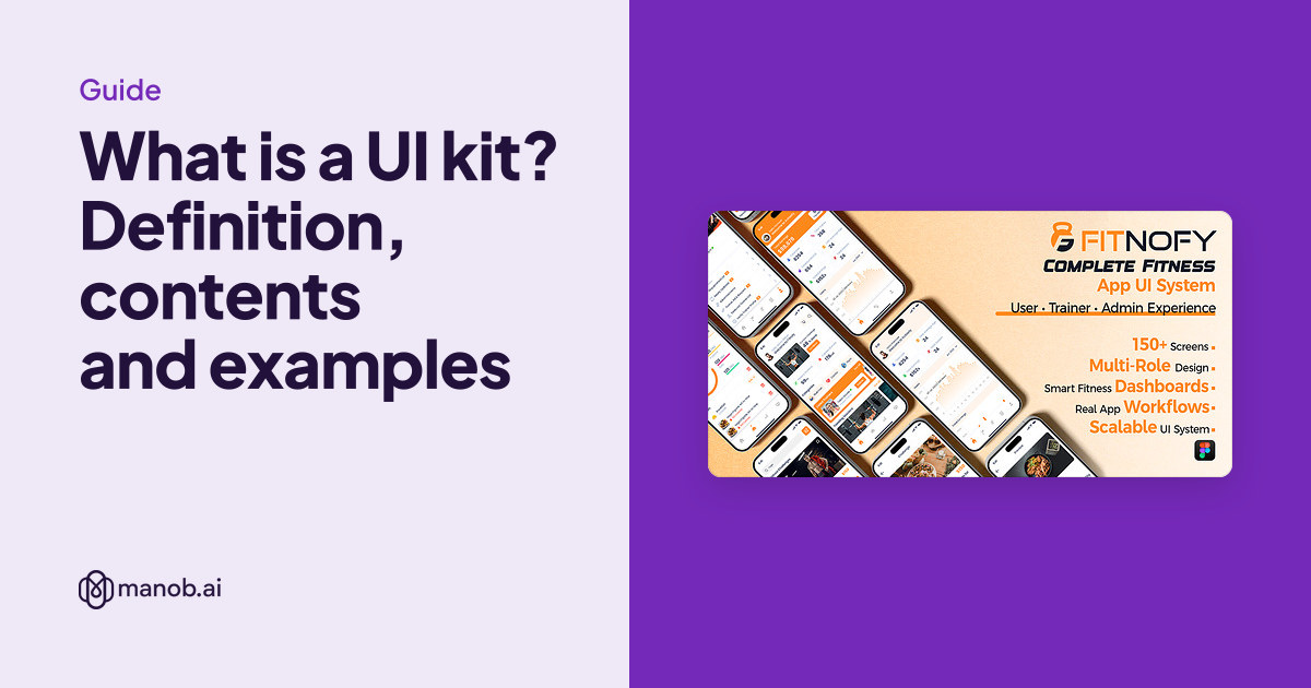
A UI kit is a ready-made set of interface parts, such as buttons, form fields, cards, navigation and icons, plus the color and type styles behind them. You reuse those parts to design screens faster and keep them consistent. Many UI kits are Figma files; others are code. A design system goes further, adding rules, documentation and matching code.
Figma's own definition is close to that. Its help center describes UI kits as libraries that "contain high-quality components, styles, variables, and example screens to kick-start your designs, even if you don't have a design system of your own." If you already know you want one and are comparing kits to buy, skip to our Figma UI kits roundup.
What's inside a UI kit?
Kits vary in size, but a useful one has four layers:
- Foundations. The color palette, type scale, spacing, grid, corner radius and shadows. In Figma these are saved as styles or variables, so changing one value updates every screen that uses it.
- Components. The reusable building blocks: buttons, inputs, dropdowns, checkboxes, toggles, cards, tabs, navigation bars, modals, tables, alerts and avatars. Good kits build each one with variants. Figma says variants "allow you to group and organize similar components into a single container," so one button component can carry every size, state and color.
- Patterns. Larger pieces assembled from components, such as a sign-up form, a pricing table, a product card grid or a dashboard header.
- Example screens. Full pages or app screens that show the parts working together. You copy one and adapt it rather than starting from a blank frame.
Underneath it all, well-made kits use auto layout. In Figma's words, the layout "adjusts without requiring manual repositioning" when content changes, so a button grows with its label and a list reflows when you add an item.
UI kit vs design system vs template
These terms overlap, and sellers use them loosely. Here's how they usually differ:
| What it is | Who it's for | Includes code? | |
|---|---|---|---|
| UI kit | Reusable components and styles, often with example screens | Designers who want to design faster and stay consistent | Usually not |
| Design system | A UI kit plus usage rules, documentation, design tokens and matching coded components | Product teams keeping many screens and people in sync | Yes |
| Website or app template | Finished pages for one kind of site or app | Anyone who wants the layout mostly done | Depends; Figma templates don't, coded templates do |
| Component library (code) | Coded, reusable UI components for a framework | Developers | Yes, that's the point |
| Style guide | Brand rules: colors, type, logo use, tone | Anyone producing brand material | No |
Two code examples show where the lines fall. Material UI calls itself "an open-source React component library that implements Google's Material Design," and it publishes Figma design kits so designers and developers work from the same parts. shadcn/ui takes a different route: its docs say "This is not a component library. It is how you build your component library," and it hands you the component code to edit yourself.
What kinds of UI kits are there?
Platform kits
The platforms publish their own. As of October 2026, Figma lists seven built-in UI kits: the Material 3 Design Kit by Google, Simple Design System by Figma, and Apple's kits for iOS and iPadOS 26, iOS and iPadOS 18, macOS 26, watchOS 26 and visionOS 26. Figma says they're available on any plan, and Apple requires you to accept its license agreement before using its kits. If you're designing a native iOS or Android app, start with the platform's kit so your screens match what users already know.
Product and app kits
These cover one kind of product, such as fitness, banking or food delivery, with screens for each user role and flow. They save the most time when your product closely matches the kit's.
Website and e-commerce kits
These focus on marketing pages and stores: hero sections, feature grids, pricing, product listings, carts and checkout. They sit close to Figma website templates, and many products are a bit of both.
Code UI kits
Some kits ship as code instead of a design file. They're built for a framework like React or Flutter, so a developer can use the components directly. A code kit with a matching Figma kit gives designers and developers the same parts.
UI kit examples on manob.ai
Three real kits show the types above. Fitnofy's Figma kit is a product kit: its listing describes 150+ editable screens for three user roles (user, trainer and gym admin), built with auto layout, reusable components and variants. Katan is an e-commerce web kit with multiple homepage, product and collection layouts, including product listings, filters and carts, for desktop and mobile. The Fitnofy Flutter kit is a code kit. Its listing says it has 200+ screens, uses GetX for state management, supports light and dark themes and six languages including right-to-left, and is built for Flutter SDK 3.x.
| Template | Type | Built with | Price from | Live demo |
|---|---|---|---|---|
| Fitnofy – Fitness App Figma UI Kit | Figma UI kit | Figma | $29 | Demo |
| Katan - Multipurpose Figma UI Kit | Figma UI kit | Figma | $25 | Demo |
| Fitnofy - Multi-Role Fitness Flutter UI Kit | Figma UI kit | — | $33 | Demo |
Our Figma UI kits roundup compares five kits in more detail, with a checklist for inspecting one before you buy.
How do you use a UI kit in Figma?
For Figma's built-in kits, its UI kits guide gives two routes:
- From the Libraries modal: open the Assets tab, click Libraries, choose UI kits and click Add to file. The components then appear in your Assets tab.
- From the Figma Community: open the kit's Community page, click Open in Figma and choose to use it in a new file or make a copy. Figma notes that copies won't receive the kit's later updates.
A kit you buy usually arrives as a .fig file you import into Figma. From there the workflow is the same:
- Set your brand first. Change the color and text styles or variables before you design anything, and check that the whole file updates.
- Build screens from instances of the kit's components, swapping variants instead of detaching and redrawing.
- Add the components you're missing in the kit's style, and keep them in the same file.
- If your team will share it, publish it as a library, which Figma offers on paid plans. Changes to the library can then flow to every file that uses it.
When the design is done, someone still has to build it. Our guide to turning Figma designs into code covers the options, and if you'd rather skip the design step, our React templates and app landing page templates are already coded.
When does a UI kit save time, and when doesn't it?
A kit pays off when you need many consistent screens fast: an MVP, an admin dashboard, an internal tool, or the first version of a design system. It also helps solo founders and developers who don't design every day, since the spacing and type decisions are already made.
It costs you time when the kit fights your product. A strong brand may need so many overrides that starting fresh would have been quicker. A kit for the wrong platform, such as an iOS kit for a web app, teaches the wrong patterns. And a design kit that doesn't match your developers' component library creates handoff work. If your front end uses Material UI, for example, its own Figma kit will line up better than a generic one.
Licensing a paid UI kit
On manob.ai, a Regular License covers a single end product whose end users aren't charged, such as one client website or one app design. An Extended License covers an end product whose end users are charged. Neither license lets you resell or redistribute the kit as-is. Each purchase includes 6 months of seller support. If you sell kits yourself, our guide to selling website templates covers what marketplaces expect from a Figma file.
When to look elsewhere
- You want a free kit. Figma's built-in kits come at no extra cost on any plan, and the Figma Community lists many more.
- You're building a native app. Apple's and Google's own kits match their platforms' current guidelines.
- Your team works code-first. A component library such as Material UI, or shadcn/ui's editable components, may serve you better than any design file.
- You need a niche we don't stock. manob.ai's Figma selection is small, so search the Figma Community for more choice.
Frequently asked questions
What is a UI kit in Figma?
It's a Figma file or library of reusable components, styles and variables, usually with example screens. Figma also has seven built-in kits from Google, Apple and Figma that you can add to a file from the Libraries modal.
Is a UI kit the same as a design system?
No. A UI kit is the set of reusable design parts. A design system adds rules for using them, documentation, design tokens and matching code, and someone who maintains it all.
What's the difference between a UI kit and a template?
A UI kit gives you parts to design your own screens. A template gives you finished pages for one kind of site that you edit. Many products include a bit of both.
Do UI kits include code?
Figma UI kits don't. Code UI kits and component libraries do, such as Flutter kits or Material UI for React, and some come with a matching Figma kit.
Are UI kits free?
Many are. Figma's built-in kits come with every plan and the Figma Community lists more free kits. Paid kits usually cover a specific product type in more depth.
Can I use a UI kit for client work?
Yes, with the right license. On manob.ai, use a Regular License when the client's end users aren't charged and an Extended License when they are, one license per end product.