
Figma to Code: How to Turn a Figma Design Into a Working Website
By Manob Editorial ·
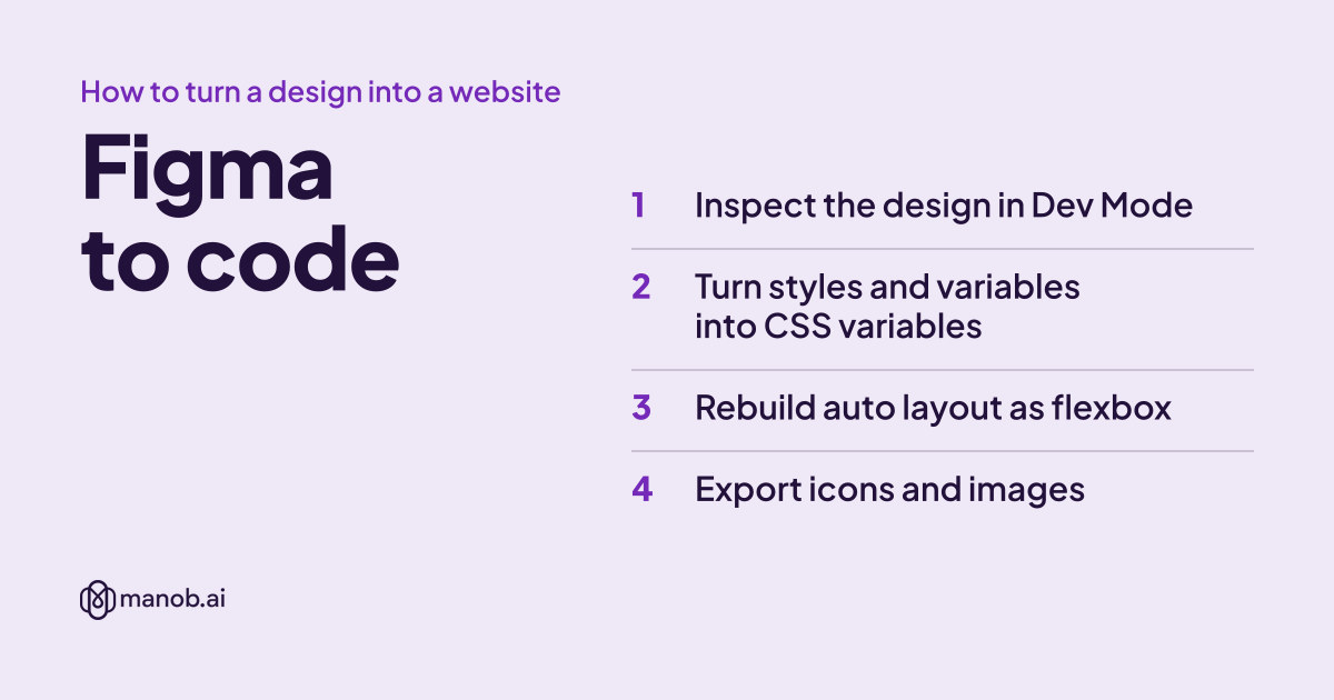
To turn a Figma design into code, inspect it in Dev Mode, copy its colors, type and spacing into CSS variables, and rebuild each auto layout frame as flexbox or grid. Export icons as SVG and photos at 2x, then test at the widths of your frames. Plugins and AI agents can write a first draft for you to review.
Figma features and plan details below come from Figma's help center and pricing page, checked on October 14, 2026. The CSS examples were tested in Chrome.
What are your options for turning Figma into code?
| Method | What you get | Good for | The catch |
|---|---|---|---|
| Hand-code from Dev Mode | Your own HTML and CSS (or components), built from the values Figma shows | Sites you'll maintain for years | Slowest. Dev Mode needs a paid plan with a Full or Dev seat |
| Code-generation plugins | HTML, React, Vue or Tailwind generated from selected frames | A first draft, prototypes | The code mirrors how the file was built, messy layers included |
| Figma MCP server plus an AI coding agent | An agent that reads your frames, variables and components and writes code in your project | Developers already using Claude Code, Cursor, VS Code or Codex | You still check every file it writes |
| Figma Make | An interactive app built from a prompt and your designs, inside Figma | Clickable prototypes and small apps | Editing its code needs a Full seat on a paid plan |
| Start from a coded template | A finished HTML or React site with a similar layout | When you don't have a design yet | You adapt someone else's design, not yours |
Before you start: is the Figma file ready for code?
Cleanup in Figma is faster than cleanup in code. Check these first:
- Auto layout everywhere. Auto layout frames translate almost one to one into flexbox. Hand-positioned groups don't, and they're why generated code fills up with absolute positions.
- Components and variants for anything repeated: buttons, cards, nav items. Each one becomes one CSS class or one component.
- Styles or variables for colors, text and spacing. Dev Mode lists the styles and variables applied to each layer, so you can give your CSS variables the same names.
- A desktop and a mobile frame for each page, for example 1440px and 375px wide. Without a mobile frame you'll be guessing how the layout should stack.
- Named layers. "Pricing card" turns into a readable class name. "Frame 427" doesn't.
Step 1: Inspect the design in Dev Mode
Figma's Dev Mode guide says Dev Mode is available on all paid plans to people with a Full or Dev seat. The pricing page FAQ says a Collab seat gets only basic inspection. Select any layer and Dev Mode shows its size, spacing, applied styles and variables, plus auto-generated code snippets. Use the snippets as a reference for values, not as code to paste. They describe one layer at a time and don't know how your page is structured.
Step 2: Turn styles and variables into CSS variables
Copy every color, font size and spacing value the design uses into one place. Keeping the Figma names makes later design changes easy to follow:
:root {
  /* colors: Figma variables color/primary, color/text … */
  --color-primary: #0f766e;
  --color-primary-hover: #115e59;
  --color-text: #1f2937;
  --color-muted: #6b7280;
  --color-border: #e5e7eb;

  /* type: Figma text styles */
  --font-sans: "Inter", system-ui, sans-serif;
  --text-h3: 1.25rem;   /* 20px */

  /* spacing: Figma number variables */
  --space-2: 0.5rem;    /* 8px */
  --space-4: 1rem;      /* 16px */
  --space-6: 1.5rem;    /* 24px */
  --radius-card: 12px;
}
Load the same fonts the design uses, at the weights it uses, or line lengths and button widths won't match.
Step 3: Rebuild auto layout as flexbox
Each auto layout setting in Figma's auto layout guide has a CSS equivalent:
| Figma auto layout | CSS |
|---|---|
| Horizontal | display: flex |
| Vertical | display: flex; flex-direction: column |
| Wrap | flex-wrap: wrap |
| Grid | display: grid with grid-template-columns |
| Gap 16 | gap: 16px |
| Gap set to Auto: Between, Around or Evenly | justify-content: space-between, space-around or space-evenly |
| Padding | padding |
| Alignment box | justify-content (main axis) and align-items (cross axis) |
| Fill container | flex: 1 along the main axis; in a column, children stretch by default |
| Hug contents | flex: none, or align-self: flex-start inside a column |
| Fixed width or height | width or height in px, plus flex: none |
| Min and max width | min-width, max-width |
| Ignore auto layout | position: absolute inside a parent with position: relative |
One difference trips people up. In Figma, a hugging child of a vertical frame keeps its own width. In CSS, children of a column stretch to full width unless you stop them, which is why the button below has align-self: flex-start.
Here's a card grid built that way. The Figma file had a wrapping "Card grid" frame (gap 24), and each "Card" was a vertical frame with padding 24 and gap 16, a horizontal header, and a "New" badge set to ignore auto layout:
<div class="card-grid">
  <article class="card">
    <span class="badge">New</span>
    <div class="card-header">
      <img class="card-icon" src="img/icon-design.svg" alt="" width="40" height="40">
      <h3 class="card-title">Web design</h3>
    </div>
    <p>Pages that load fast and read well on phones.</p>
    <a class="button" href="/contact">Get a quote</a>
  </article>
  <!-- more cards -->
</div>
.card-grid {
display: flex;
flex-wrap: wrap; /* Wrap */
gap: var(--space-6); /* Gap 24 */
}
.card {
position: relative; /* for the badge */
display: flex;
flex-direction: column; /* Vertical */
gap: var(--space-4); /* Gap 16 */
padding: var(--space-6); /* Padding 24 */
flex: 1 1 280px; /* Fill container, starting from 280px */
max-width: 400px;
border: 1px solid var(--color-border);
border-radius: var(--radius-card);
}
.card-header {
display: flex; /* Horizontal */
align-items: center;
gap: var(--space-2);
}
.card-icon { width: 40px; height: 40px; flex: none; } /* Fixed */
.card-title { flex: 1; margin: 0; font-size: var(--text-h3); } /* Fill */
.button { align-self: flex-start; } /* Hug */
.badge { position: absolute; top: 12px; right: 12px; } /* Ignore auto layout */The flex: 1 1 280px line does the responsive work. In our test, three cards sat in a row at laptop width and dropped to one per row at phone width, with no media query.
Step 4: Export icons and images
- Icons and logos: export as SVG. Dev Mode detects icons automatically, and the guide lists PNG, JPG, SVG and PDF as export formats.
- Photos: export at 2x as PNG or JPG, then convert to WebP for the web, with Squoosh or the command-line encoder:
cwebp -q 80 hero@2x.png -o hero@2x.webp. - Size them in the markup so the page doesn't jump while images load:
<img src="img/hero-1200.webp"
     srcset="img/hero-800.webp 800w, img/hero-1200.webp 1200w, img/hero-2400.webp 2400w"
     sizes="(min-width: 1200px) 1200px, 100vw"
     width="1200" height="675" alt="Plumber fixing a kitchen sink">
Check the license of every photo in the file before you ship it. KidVerz's listing, for example, credits Freepik, Unsplash, Flaticon and IconScout as sources.
Step 5: Build mobile-first and compare with the frames
Write the mobile layout first, then add breakpoints where the desktop frame differs:
.hero { padding: 48px 16px; }
.hero h1 { font-size: clamp(2rem, 1.4rem + 3vw, 3.5rem); }

@media (min-width: 768px) {
  .hero { padding: 96px 32px; }
}
Then open the browser at the exact width of each Figma frame (1440px and 375px here) with zoom at 100%, and compare spacing, font sizes and line breaks side by side. Slightly different line wrapping is normal, because browsers render text differently from Figma. Different spacing usually means a mistake.
Should you use a Figma to code plugin or an AI agent?
They're worth trying for a first draft, as long as you treat the output as a draft:
- Anima generates code from inside Figma and lists HTML, CSS, React, Vue, Tailwind, shadcn, TypeScript and Next.js among its outputs.
- Builder.io Visual Copilot converts designs with AI and lists React, Qwik and Angular, with Tailwind CSS or CSS Modules for styling, plus mobile output.
- The Figma MCP server gives AI coding tools your design context: "Select a Figma frame and turn it into code." The remote server is available on all seats and plans, and the desktop server on a Dev or Full seat on paid plans. Figma's pricing page lists tool-call limits that vary by plan. In Claude Code, Figma's setup article recommends the plugin:
claude plugin install figma@claude-plugins-official. - Figma Make builds an interactive app from a prompt and existing designs. Full or Dev seats can download its code as a .zip; editing it needs a Full seat on a paid plan.
Whatever writes the first draft, check the same things: absolutely positioned elements that should be flex items, fixed pixel widths that break on phones, clickable divs that should be button or a elements, missing alt text, and one-off class names where a component should repeat.
If you'd rather keep iterating in a browser, manob.ai's AI workspace includes an AI chat, an agentic code editor, a cloud sandbox with live preview and deploy on the free Starter plan (1,000 AI Energy a month). Builder ($12/month) adds full-stack builds with an API, database and auth, plus a custom domain. See plans.
Practice files: Figma kits you can convert
If you want to practice on a real design, these Figma files on manob.ai are website or app kits. Katan's listing says it supports desktop and mobile layouts, KidVerz's lists nine page designs plus a responsive mobile home screen, and Fitnofy's lists auto layout and reusable components across 150+ app screens. Zolafi is an agency site design. Every item can be previewed before purchase.

Katan is a modern and versatile Figma UI template designed for creating high converting eCommerce websites. It features multiple layouts, clean and customizable design, and user…

KidVerz is a modern Figma UI template designed for kids fashion, baby shops, toys, stationery, and accessories stores. It features clean layouts, colorful visuals, organized com…

"Zolafi" is a premium, modern, and pixel-perfect Figma template designed specifically for IT firms, creative agencies, and tech startups. It features a sleek, user-friendly layo…

Fitnofy is a premium Figma UI Kit designed for gyms, fitness centers, personal trainers, and wellness platforms. It features 150+ professionally crafted screens, complete user f…
A Regular License covers a single end product whose end users aren't charged; an Extended License covers one where they are, and neither lets you redistribute the files as-is (license terms). For more kits, see our Figma UI kit picks or the UI templates category.
When converting a design isn't worth it
If you don't have a design yet, starting from a coded template is faster than designing and converting. Compare HTML5 templates or React and Next.js templates, and see our guide to editing a Bootstrap template. When the code works, read how to move HTML to React or deploy the site.
Frequently asked questions
Can Figma export a design as HTML and CSS?
Not as a finished website. Dev Mode shows code snippets for individual layers, and plugins such as Anima or the Figma MCP server with an AI agent can generate whole pages, but you'll still structure and clean up the code yourself.
Is Figma Dev Mode free?
No. Figma's help center says Dev Mode is available on all paid plans to people with a Full or Dev seat, and the pricing page says a Collab seat gets only basic inspection.
How do I convert Figma to React instead of HTML?
Follow the same steps, but turn each Figma component into a React component and each variant into a prop. Anima, Builder.io and AI agents using the Figma MCP server can all output React, and our HTML to React guide covers the JSX differences.
Why does my coded page look different from the Figma design?
Usually it's fonts, missing gaps or padding, or a browser zoom that isn't 100%. Check the font family and weights first, then compare spacing at the exact frame width.
What makes a Figma file easy to convert to code?
Auto layout on every frame, components for repeated elements, variables or styles for colors and type, named layers, and a separate mobile frame for each page.